Instead of bringing out new versions of Windows, Microsoft has been taking a different path since Windows 10 – and operating on the existing system. The group has now announced its latest repainting. Many of the innovations catch the eye immediately; others only become apparent later.
Windows 10 is the last of its versions, Microsoft announced at the launch. Instead of developing a new operating system every few years, the group has since preferred to convert its existing system, screw it under the hood and polish the optics. Microsoft has now released the latest conversions for testing, which was announced in a blog post. While some stand out immediately, others are likely to change the workflow only in the long run.
The start menu becomes clearer.
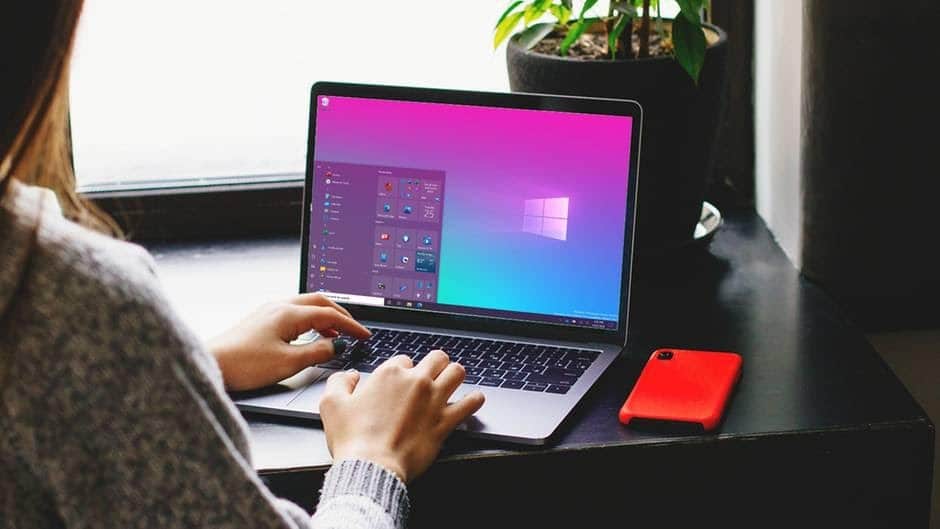
The most striking innovation is the new start menu. The striking tile look introduced for the first time with Windows 8 has been limited to the Start menu since Windows 10, now it is becoming even more subtle. The tiles are no longer colored but have been adapted to the color of the start menu. Depending on the selected color scheme, they are now transparent in light or dark gray. Bringing color into the menu is still possible, but then the entire menu is discreetly colored. It looks like the picture at the top.
The change has clear advantages in use. Due to the reserved look of the menu, the logo of the programs represented by the tiles has a better color contrast; the menu appears much clearer and clearer. At the same time, the live tiles, which display relevant information from the apps directly in the tile, also go down less.
Order in tab chaos
A change should clearly drive users to Microsoft’s unpopular browser Edge. With the keyboard combination Alt and Tab, you can quickly switch back and forth between the active programs. You then have to search for the appropriate tab in the browser again by hand. Now open edge tabs can be called up directly via the key combination; web pages become one program alongside others. A very useful feature – for just under two-per-cent of desktop users who use Edge. If you don’t like the browser or are put off by too many tabs, you can turn off the function again.
The function ties in with Microsoft’s original plans to equip almost every program with tabs. They were actually rejected long ago. As expected, Microsoft did not reveal whether the function should also be opened in the long run for more popular browsers such as Google Chrome or Firefox. At the moment, however, this seems rather unlikely.
Not every feature comes to everyone.
For some reason, there is not an exciting innovation for everyone. Microsoft wants to allow the taskbar to be expanded to include cloud elements and to make it adaptable. For example, Android users should be able to have their synchronized smartphone displayed directly in the taskbar, and gamers should have faster access to their Xbox Live account. But Microsoft warns: The function has so far been limited to newly created accounts or first logins. The group does not give an explanation for this.
Another feature is aimed at a top target group: Microsoft is optimizing its system for hybrid devices that can switch back and forth between tablet and desktop mode, such as Microsoft’s Surface tablets. The change should now take place completely automatically when the keyboard is removed. In order not to confuse desktop users without a touchscreen, the icon for switching to tablet mode is removed on these devices.
Tidy notifications
The notifications are long known from tablets and smartphones also got a prominent place in Windows 10 with its own notification center. Now they are significantly optimized again: finally, the notifications in the upper left corner show which app they belong to. And you can get rid of them quicker: If you click on the “X” in the top right, as in other windows, the notification is marked as done.
Microsoft also fixes a bizarre system habit: If Windows goes into sleep mode, in which not to be disturbed with notifications, the system reports this cheerfully – with a notification. It has now been deleted in the standard-setting. If you want to see the hint, you can turn it on again.
Other innovations are a curve-shaping tool in Microsoft’s calculator, which should be very convenient for schoolchildren and students. Numerous bugs are also fixed.
It will take a few weeks until the innovations are received by the users. Microsoft initially only incorporates the features into the current test version of its insider program. The group emphasizes that the individual changes are not yet tied to specific program versions and a release schedule. If individual functions prove to be impractical or incorrect, they can certainly be changed again or even deleted.

